Project duration
3 months
Client
Cielo
Cielo Sales/Rental Machine Flow Optimization: 67% Faster Negotiations

Context
Cielo+ is an app dedicated to selling Cielo Credit Card Machine Plans for commercial establishments. It offers features such as prospecting leads, recording visits, conducting negotiations, technical support for equipment, drafting contracts, and financial consultations.
Problem
Cielo's core sales and rental negotiation workflow for credit/debit card terminals involved over 3 distinct modules, each comprising multiple steps. This fragmented and lengthy process created significant friction for sales representatives during customer interactions, leading to user fatigue, reduced conversion rates, and prolonged negotiation cycles.
Solution
Through quantitative and qualitative research, we identified key pain points in the negotiation process. After prototyping and conducting usability tests, we consolidated 3 modules into a single streamlined interface, reducing the workflow from 19 negotiation steps to just 5. This optimization cut negotiation time by 65%, empowering sales representatives to focus on customer needs and drive faster conversions.
Results
Overall app rating increased from 4.47 to 4.73
Average negotiation time decreased from 15min+ to 5min
The number of complaints about the negotiation module has decreased by 70% since the implementation of the new module
Increase in the number of monthly quotes
Increase in sales of credit card machines
What is Cielo's negotiation module?
Is an in-app module for selling credit card plans and machines for commercial stores. It works as follows. A Cielo sales representative goes to the stores with the application in hand and negotiates the most suitable plan and machine with the owner of the establishment. Once you accept the offer, the store will start operating with a Cielo credit card machine.
Discovery and Definition
Discovery and Definition
Discovery and Definition
Together with Cielo's ux research team, we carried out quantitative research mapping all the app's modules, including the negotiation module. From 1776 App users we received 178 responses.
Focusing on the negotiation module, we began a second stage of research with a qualitative focus, interviewing 12 users to better understand their pain points.
With the research, we discovered that users were dissatisfied with:
The app has 3 modules to negotiate instead of one
Tiring flow and very long to negotiate, resulting in long waits with the owners of commercial establishments
We had two primary goals:
Unify the 3 negotiation flows into 1
Make the trading experience faster and more efficient
Context
Cielo+ is an app dedicated to selling Cielo Credit Card Machine Plans for commercial establishments. It offers features such as prospecting leads, recording visits, conducting negotiations, technical support for equipment, drafting contracts, and financial consultations.
Problem
Cielo's core sales and rental negotiation workflow for credit/debit card terminals involved over 3 distinct modules, each comprising multiple steps. This fragmented and lengthy process created significant friction for sales representatives during customer interactions, leading to user fatigue, reduced conversion rates, and prolonged negotiation cycles.
Solution
Through quantitative and qualitative research, we identified key pain points in the negotiation process. After prototyping and conducting usability tests, we consolidated 3 modules into a single streamlined interface, reducing the workflow from 19 negotiation steps to just 5. This optimization cut negotiation time by 65%, empowering sales representatives to focus on customer needs and drive faster conversions.
Results
Overall app rating increased from 4.47 to 4.73
Average negotiation time decreased from 15min+ to 5min
The number of complaints about the negotiation module has decreased by 70% since the implementation of the new module
Increase in the number of monthly quotes
Increase in sales of credit card machines
Merging our three modules into one
“Customers are always in a hurry, we can’t take their time.
The entire process could be more automated.”
“I don't understand why there are 3 modules to negotiate. It sometimes takes us a long time to find the best conditions”
“I find negotiation screens too long to do in front of the client”
Main pain points of users interviewed in the survey
Merging our three modules into one.
“Customers are always in a hurry, we can’t take their time.
The entire process could be more automated.”
“I don't understand why there are 3 modules to negotiate. It sometimes takes us a long time to find the best conditions”
“I find negotiation screens too long to do in front of the client”
Main pain points of users interviewed in the survey
Quantitative data
More precise and brief equipment offer
More precise and brief equipment offer
More precise and brief equipment offer
During our discovery journey, we noticed that many users complained about the credit card machine offering area.
Some pains were found:
The table with equipment information was confusing, and very compressed, making it difficult to read.
The button on the editing machines had a small click area and the icon did not make it clear to the user that it was an edit.
There was no sum of the total value of the quantity of machines and the price.
Many users reported that the current amount that the customer paid was not necessary, as the customer was already informed at the time.
The offer included a lot of equipment that was already outdated, which Cielo no longer sold.

Before
After
Improvements made:
We reduced the cognitive load on the screen, changing the table and bringing visual information to the user when viewing the machines present in the offer
We have increased the click area of the equipment edit button
The offer of equipment stopped being a step in the negotiation flow and became part of the offer as a whole, reducing the number of steps and negotiation time, hence the choice of card.
We removed the current amount the customer paid
Finally, we insert a totalizer with the sum of the quantity of equipment and price
From 19 Steps to 5: Unifying 3 Modules into a Single Negotiation Flow
From 19 Steps to 5: Unifying 3 Modules into a Single Negotiation Flow
From 19 Steps to 5: Unifying 3 Modules into a Single Negotiation Flow
One of the primary challenges was streamlining the transaction process to reduce complexity and user fatigue. By consolidating three standalone modules into a unified interface—informed by insights from user research and usability testing—we shortened the user journey by over 60%, creating a more intuitive and frictionless experience.
Some pains were found:
Using all trading modules led to an average transaction time of 15+ minutes. Users reported excessive duration as a key pain point, causing customer friction, drop-offs, and frustration among store managers who needed to prioritize other operational tasks.
Visual components were outdated and inconsistent, undermining usability and aesthetic cohesion.
Screens suffered from cognitive overload due to densely packed information in limited space, complicating navigation and comprehension.
Some icons lacked intuitive alignment with their corresponding actions, creating confusion.
The deal summary screen failed to display all contracted products, preventing users from reviewing or sharing transaction details with clients.
The competitor information screen was unnecessarily complex, with redundant fields that discouraged engagement. User research revealed that this step was frequently skipped, compromising data completeness.
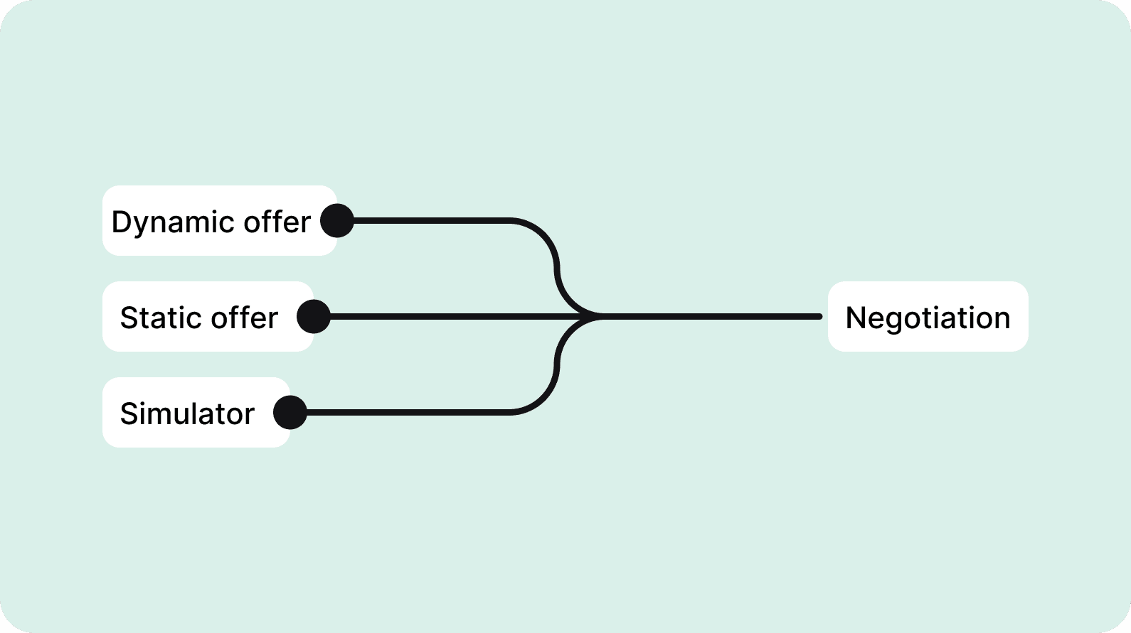
Infrequently utilized flows, such as dynamic and static offerings, each required four steps. This redundancy unnecessarily extended the negotiation journey.
One of the primary challenges was streamlining the transaction process to reduce complexity and user fatigue. By consolidating three standalone modules into a unified interface—informed by insights from user research and usability testing—we shortened the user journey by over 60%, creating a more intuitive and frictionless experience.
Some pains were found:
Using all trading modules led to an average transaction time of 15+ minutes. Users reported excessive duration as a key pain point, causing customer friction, drop-offs, and frustration among store managers who needed to prioritize other operational tasks.
Visual components were outdated and inconsistent, undermining usability and aesthetic cohesion.
Screens suffered from cognitive overload due to densely packed information in limited space, complicating navigation and comprehension.
Some icons lacked intuitive alignment with their corresponding actions, creating confusion.
The deal summary screen failed to display all contracted products, preventing users from reviewing or sharing transaction details with clients.
The competitor information screen was unnecessarily complex, with redundant fields that discouraged engagement. User research revealed that this step was frequently skipped, compromising data completeness.
Infrequently utilized flows, such as dynamic and static offerings, each required four steps. This redundancy unnecessarily extended the negotiation journey.
Improvements made:
Average negotiation time reduced from 15+ minutes to 5 minutes, ensuring faster and more efficient processes for users and customers.
Reduce the cognitive load present on screens
We standardized and updated some components according to the new design system
We have improved the negotiation summary screen by providing details of the contracted products
We removed the competitor information screen and placed it on another journey that made more sense
The dynamic offer and static offer modules have been discontinued, to make way for a single negotiation flow, shortening the journey
3 Modules - 19 steps
3 Modules - 19 steps - 15min+
Before (Recording the flow of the 3 modules)
Before (Recording made of the 3 modules)
1 module - 5 steps
1 module - 5 steps - 5 min
After

Before
After
Improvements made:
Average negotiation time reduced from 15+ minutes to 5 minutes, ensuring faster and more efficient processes for users and customers.
Reduce the cognitive load present on screens
We standardized and updated some components according to the new design system
We have improved the negotiation summary screen by providing details of the contracted products
We removed the competitor information screen and placed it on another journey that made more sense
The dynamic offer and static offer modules have been discontinued, to make way for a single negotiation flow, shortening the journey
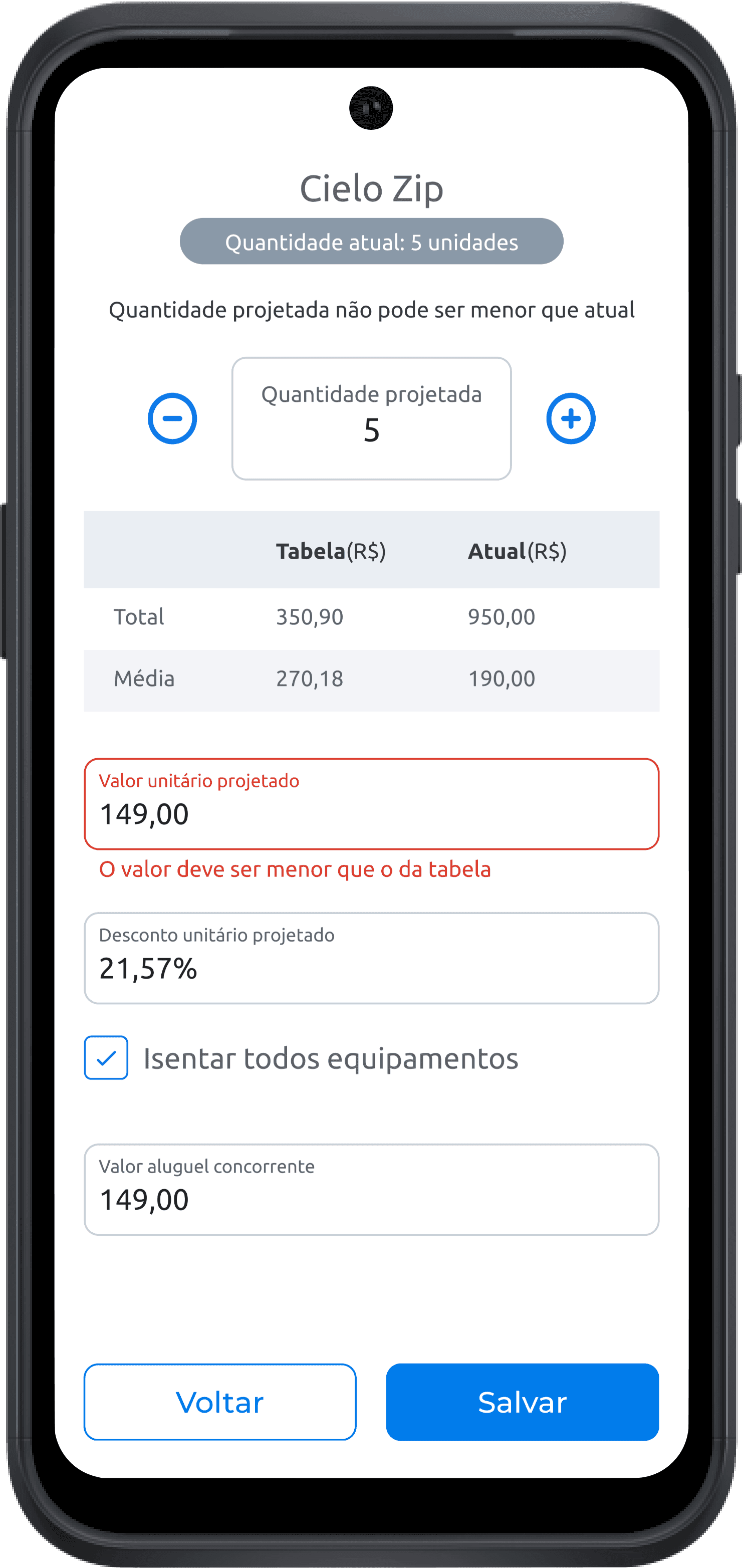
Clearer rent negotiation
Clearer rent negotiation
Clearer rent negotiation
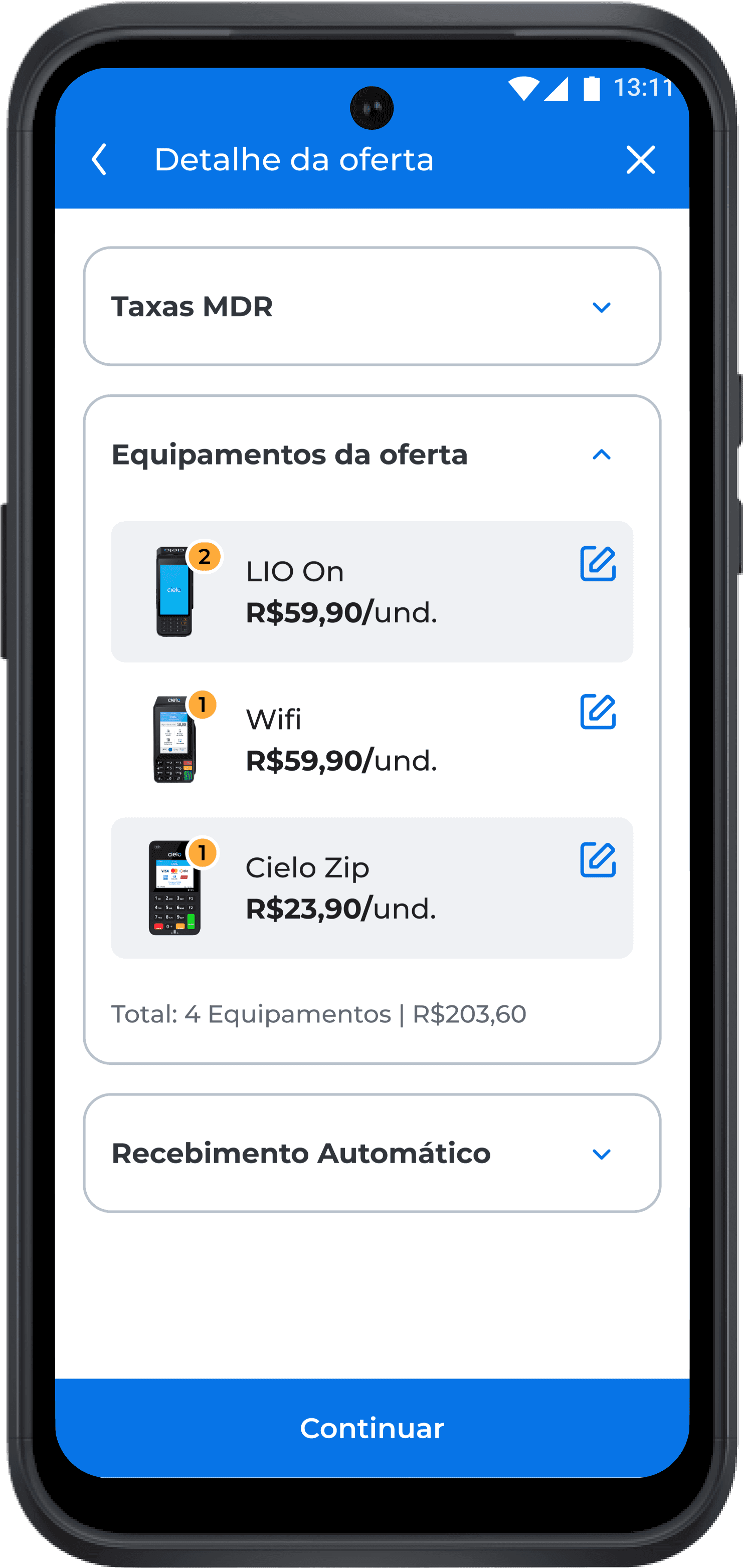
On the equipment editing screen, some things were not clear to users.
Some pains were found:
The table that indicated the price of the equipment was confusing, mixing 4 unnecessary values. The total, average, and current. Many users complained, as they only wanted to know how much the machine rental cost.
Many did not know how to give a discount on machine rental, as the information was not clear.
Information about a competitor's rental only became more confusing when negotiating, as many felt it was unnecessary to capture this information at that time.
Critical details were missing, such as the payment amount due upon reaching revenue targets, grace periods within the terms of the contract, and the validity period of the offer. This lack of transparency generated confusion among users and end customers.
There was no totalizer with the sum of the rental prices, so users often had to do the calculation directly on the calculator.
Before

After
Improvements made:
We made the rental value more clearly highlighted and removed the table with other values that were unnecessary.
We highlight the button to negotiate a discount on machine rental.
We include information on validity, grace period and goal achievement and remove the value input from the competitor and allocate it to another area.
We include a totalizer with the sum of the rental value and the total number of machines.
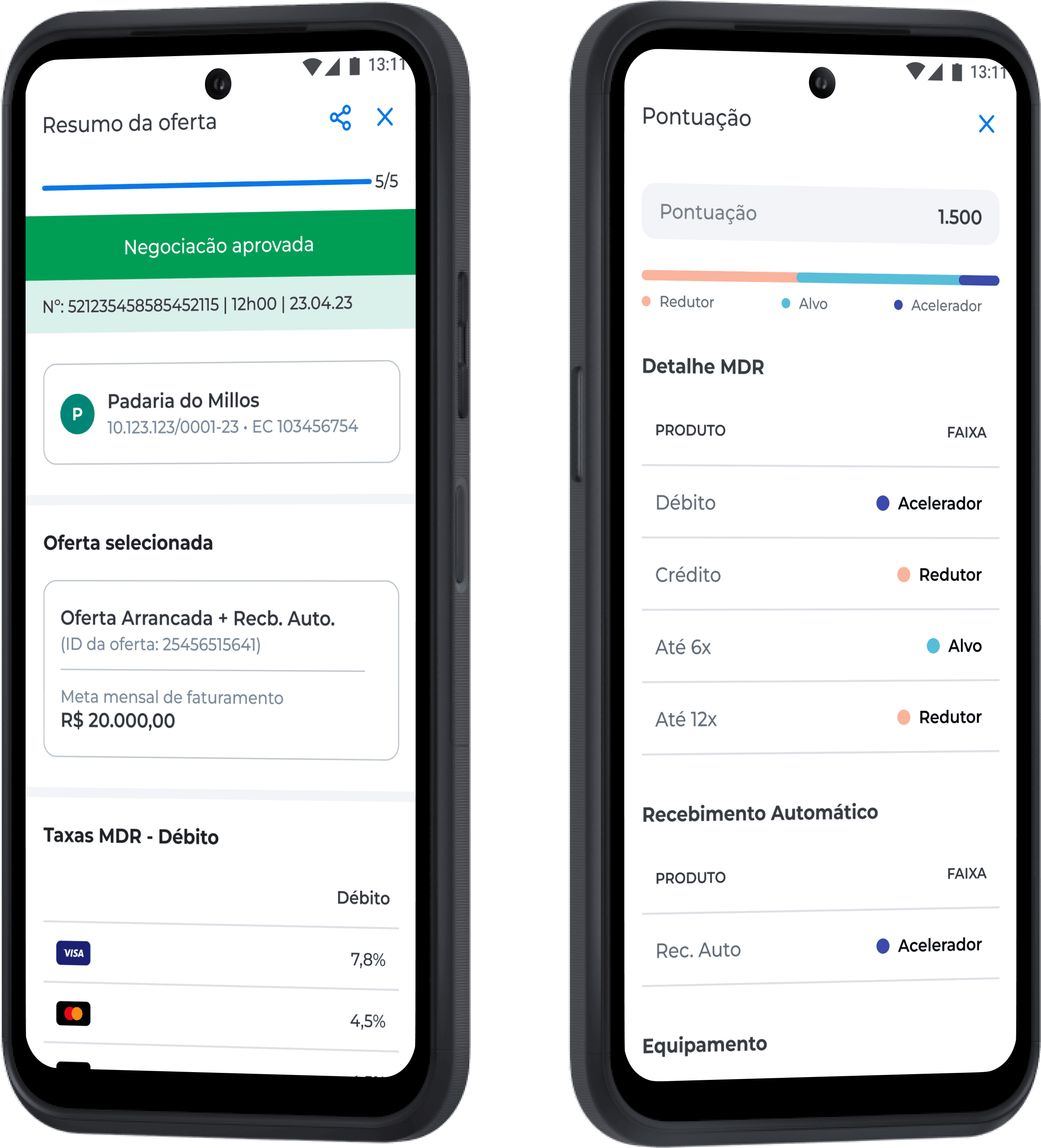
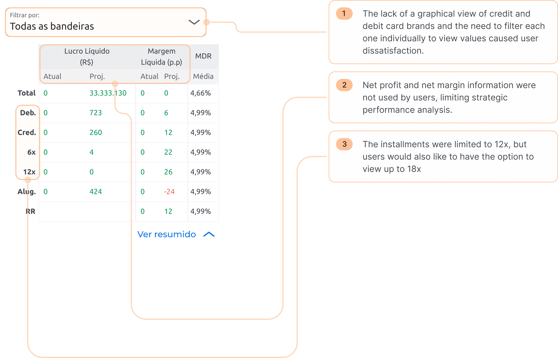
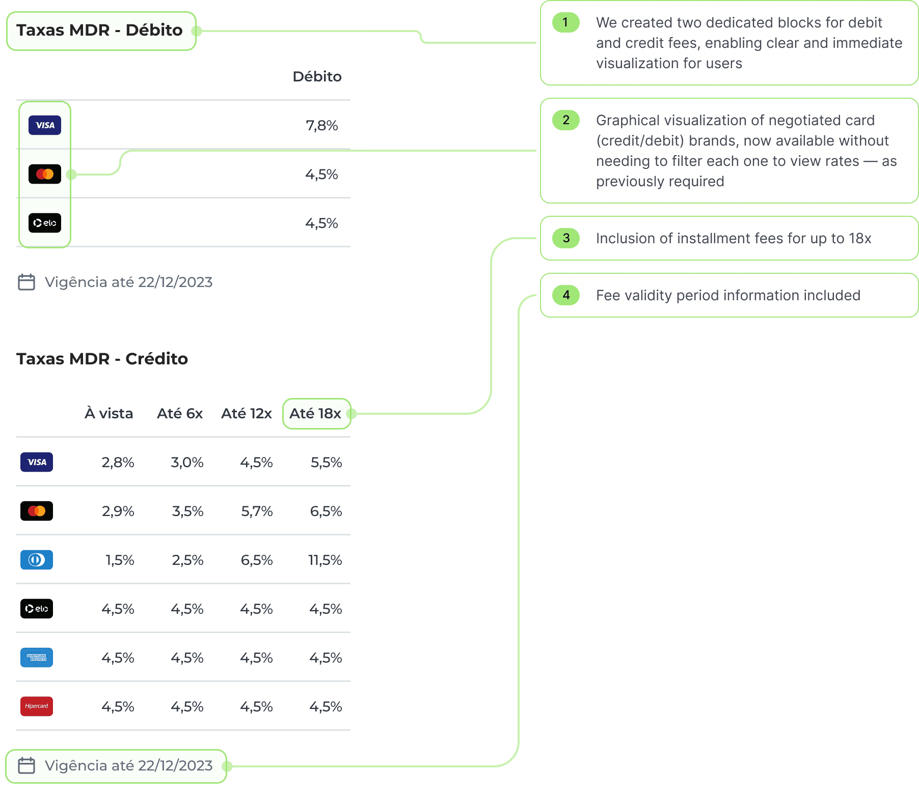
New fee component: clarity and efficiency in the deal summary screen
One of the critical points identified during in-depth interviews with sales representatives was the visibility of negotiated fees on the deal summary screen. The analysis revealed the following challenges:
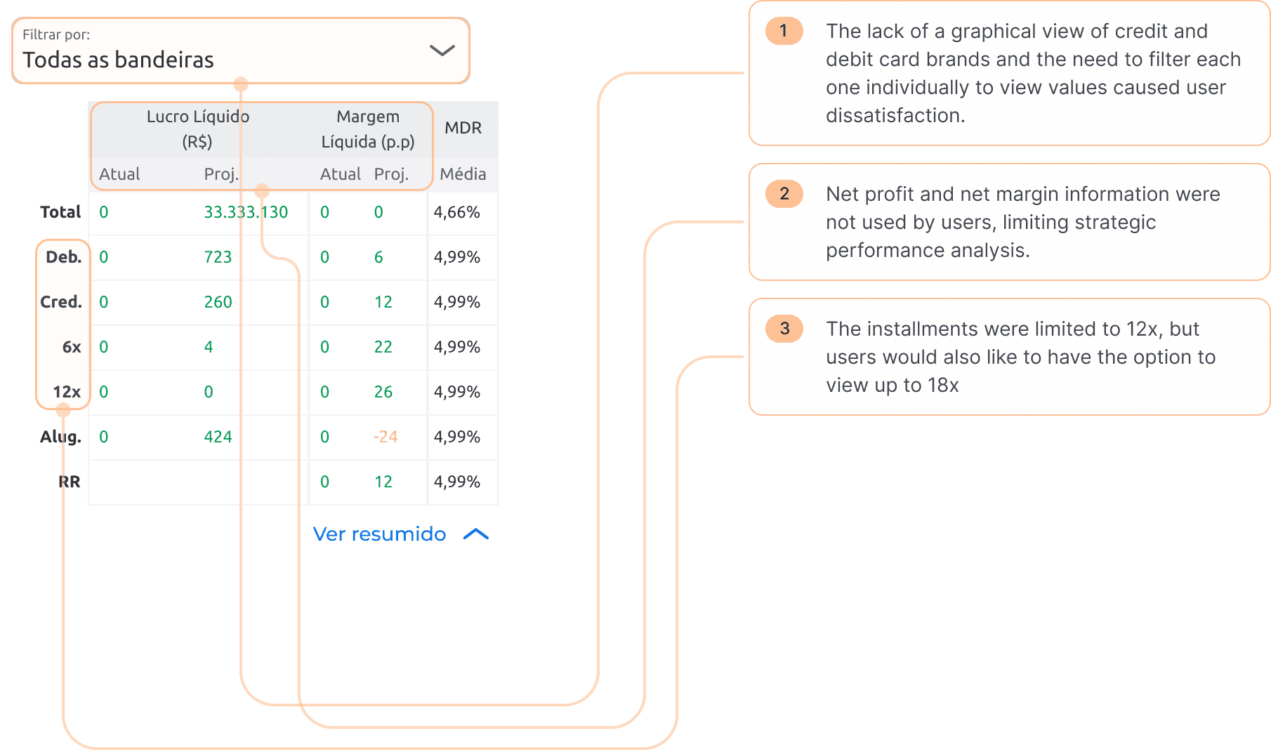
Lack of visibility for rates by card flag: There was no clear graphical representation of all negotiated debit and credit card flags. Users had to manually filter each one to view negotiated rates, which extended service time and created discomfort during in-person client negotiations.
Lack of information hierarchy: Negotiated rates were displayed alongside other important data but lacked visual prioritization. This caused critical information to get lost in the interface, leading to confusion — especially for new users, who struggled to quickly identify essential details.
Irrelevant data for the context: Details like net profit and net margins were not relevant to decision-making during negotiations, occupying unnecessary space.
Missing strategic information: There was no information on installment rates (up to 18x) and the negotiation validity period.
See the before and after below with the improvements made.
New negotiation summary screen
New negotiation summary screen
New negotiation summary screen
After analyzing user reports, we found that there was a lack of crucial information for the user to check on the products that had been previously selected. The following issues were detected:
Overloaded and confusing tables: Critical product contract details were hard to interpret due to poor visual organization and information clutter.
Lack of cost and equipment transparency: Unconfirmed number of contracted equipment units, undisclosed individual costs, and total value sum unavailable.
Insufficient receivables advance details: Installment-specific amounts not displayed, with no visibility into advance limits or conditions.
Incomplete establishment data: Missing key information such as EC number (Commercial Establishment ID) and tax ID (CNPJ).
Complex MDR (Merchant Discount Rate) analysis: Manual filtering required to calculate average rates by card brand, delaying strategic decisions.
Missing critical features: No option to share negotiation data with clients, save negotiations, or display offer ID, date, and time.
After analyzing user reports, we found that there was a lack of crucial information for the user to check on the products that had been previously selected. The following issues were detected:
Overloaded and Confusing Tables: Critical deal summary details were hard to interpret due to poor information hierarchy and visual disorganization. All relevant data — such as debit and credit fees, rental fees, and receivable anticipation — were crammed into a single table, creating visual noise and hindering quick identification of key information.
Lack of cost and equipment transparency: Unconfirmed number of contracted equipment units, undisclosed individual costs, and total value sum unavailable.
Insufficient receivables advance details: Installment-specific amounts not displayed, with no visibility into advance limits or conditions.
Incomplete establishment data: Missing key information such as EC number (Commercial Establishment ID) and tax ID (CNPJ).
Complex MDR (Merchant Discount Rate) analysis: Manual filtering required to calculate average rates by card brand, delaying strategic decisions.
Missing critical features: No option to share negotiation data with clients, save negotiations, or display offer ID, date, and time.
Before
After
Improvements made:
Removal of overloaded tables and implementation of clearer visualization methods, including simplified layout with information hierarchy, optimized spacing, and highlighted priority data (contracted products).
Full cost and equipment transparency, with detailed list of contracted equipment, confirmed unit counts, disclosed individual costs, and total sum of values.
Complete receivables advance breakdown, offering installment-specific amounts, terms, and advance percentages.
Complete establishment data, displaying EC number (Commercial Establishment ID) and tax ID (CNPJ) in a user-friendly format.
Simplified MDR (Merchant Discount Rate) analysis, with automated average rate calculations by card brand.
New strategic features, such as sharing negotiation data via email and WhatsApp, saving negotiations, and automatic display of offer ID, date, and time.
Check all improvement details below.
Improvements made:
To streamline the experience, we removed the complex table and established a clear visual hierarchy, organizing each piece of information with its respective details. The new structure integrates business establishment data, negotiated debit and credit fees (with all card flags visible without manual filtering), and rental and receivables anticipation details, prioritizing readability. The outcome is a cleaner, more intuitive interface, with data organized by relevance, clear detailing, and fewer unnecessary steps to access critical information — all focusing on clarity, precision, and ease of interpretation during negotiations.
Full cost and equipment transparency, with detailed list of contracted equipment, confirmed unit counts, disclosed individual costs, and total sum of values.
Complete receivables advance breakdown, offering installment-specific amounts, terms, and advance percentages.
Complete establishment data, displaying EC number (Commercial Establishment ID) and tax ID (CNPJ) in a user-friendly format.
Simplified MDR (Merchant Discount Rate) analysis, with automated average rate calculations by card brand.
New strategic features, such as sharing negotiation data via email and WhatsApp, saving negotiations, and automatic display of offer ID, date, and time.
Check all improvement details below.
New fee component: clarity and efficiency in the deal summary screen
One of the critical points identified during in-depth interviews with sales representatives was the visibility of negotiated fees on the deal summary screen. The analysis revealed the following challenges:
Lack of visibility for rates by card flag: There was no clear graphical representation of all negotiated debit and credit card flags. Users had to manually filter each one to view negotiated rates, which extended service time and created discomfort during in-person client negotiations.
Lack of information hierarchy: Negotiated rates were displayed alongside other important data but lacked visual prioritization. This caused critical information to get lost in the interface, leading to confusion — especially for new users, who struggled to quickly identify essential details.
Irrelevant data for the context: Details like net profit and net margins were not relevant to decision-making during negotiations, occupying unnecessary space.
Missing strategic information: There was no information on installment rates (up to 18x) and the negotiation validity period.
See the before and after below with the improvements made.
Before
After
After
New fee component: clarity and efficiency in the deal summary screen
One of the critical points identified during in-depth interviews with sales representatives was the visibility of negotiated fees on the deal summary screen. The analysis revealed the following challenges:
Lack of visibility for rates by card flag: There was no clear graphical representation of all negotiated debit and credit card flags. Users had to manually filter each one to view negotiated rates, which extended service time and created discomfort during in-person client negotiations.
Lack of information hierarchy: Negotiated rates were displayed alongside other important data but lacked visual prioritization. This caused critical information to get lost in the interface, leading to confusion — especially for new users, who struggled to quickly identify essential details.
Irrelevant data for the context: Details like net profit and net margins were not relevant to decision-making during negotiations, occupying unnecessary space.
Missing strategic information: There was no information on installment rates (up to 18x) and the negotiation validity period.
See the before and after below with the improvements made.
Measuring and validating designs
Measuring and validating designs
Measuring and validating designs
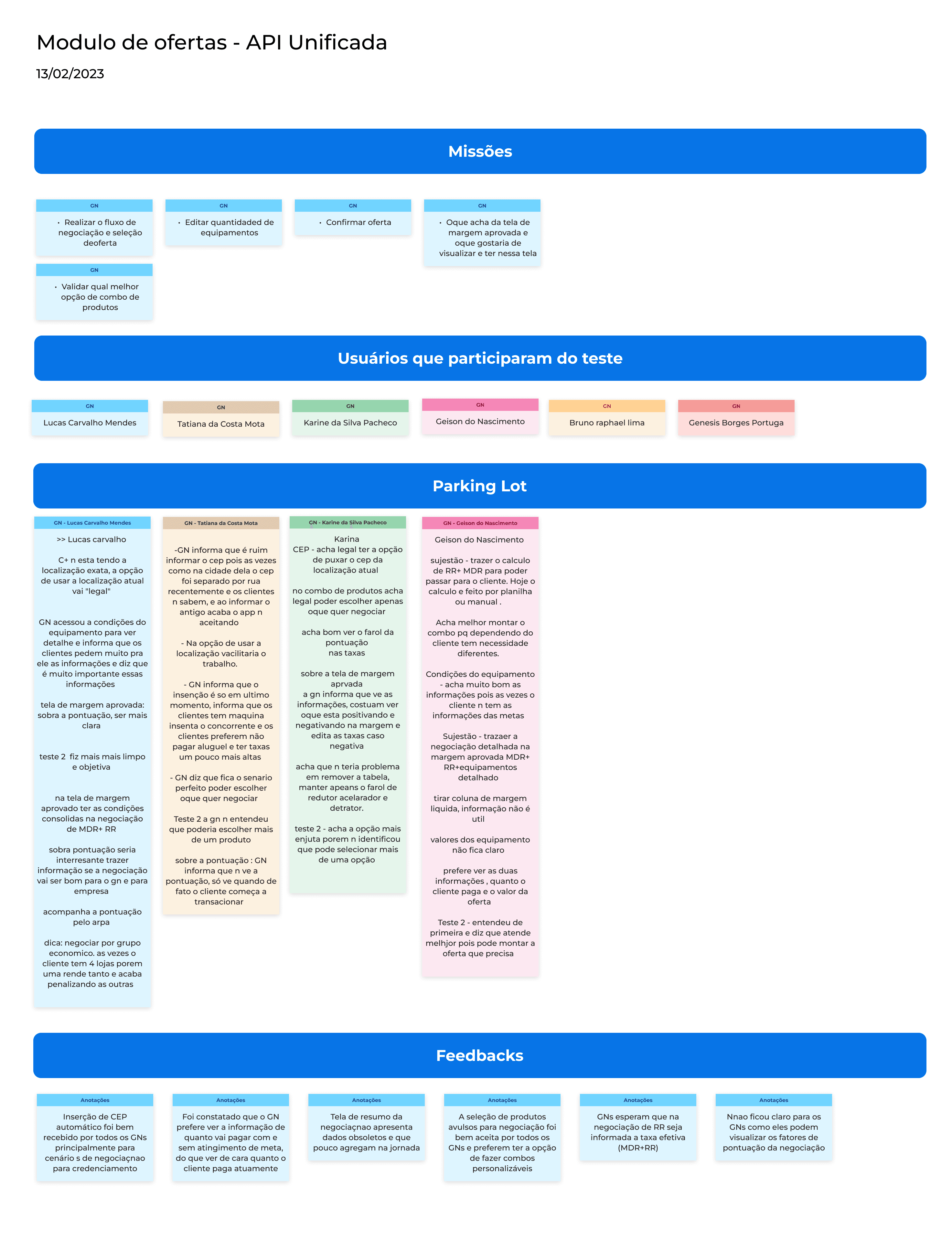
We started with design drafts and alignment meetings with POs, the business team, and developers to validate our design decisions. With the scope defined, we began moderated qualitative usability testing. We also did A/B tests.
In total, 6 users of different experience levels were interviewed in these two tests.
We made the necessary adjustments with user feedback and carried out another round of tests with the same users.
Once the tests were finished, we held another meeting, this time for refinement with POs, business team and developers, and QA's to present the final prototype.
After implementation, we continued to measure the success of the new module, through a satisfaction survey, the average time to complete the new flow, number of flow evasions. We also pay attention to the number of complaints about the module with the support team and the number of negotiations per month.

Usability test images

Usability test images
Usability test images
The Result
The Result
After the usability tests, we already had a prediction of what the results could be based on the SUS usability scale. Everyone pointed out a result of 86 points.
After 3 months after implementation, we noticed that:
Overall app rating increased from 4.47 to 4.73
Average negotiation time decreased from 15min+ to 5min
The number of complaints about the negotiation module has decreased by 70% since the implementation of the new module
Increase in the number of monthly quotes
Increase in sales of credit card machines
After the usability tests, we already had a prediction of what the results could be based on the SUS usability scale. Everyone pointed out a result of 86 points.
After 3 months after implementation, we noticed that:
Overall app rating increased from 4.47 to 4.73
Average negotiation time decreased from 15min+ to 5min
The number of complaints about the negotiation module has reduced by 70% since the implementation of the new module
Increase in the number of monthly quotes
Increase in sales of credit card machines
Project duration
3 months
Client
Cielo
Cielo Sales/Rental Machine Flow Optimization: 67% Faster Negotiations
Project duration
3 months
Client
Cielo
Cielo Sales/Rental Machine Flow Optimization: 67% Faster Negotiations
Context
Cielo+ is an app dedicated to selling Cielo Credit Card Machine Plans for commercial establishments. It offers features such as prospecting leads, recording visits, conducting negotiations, technical support for equipment, drafting contracts, and financial consultations.
Problem
Cielo's core sales and rental negotiation workflow for credit/debit card terminals involved over 3 distinct modules, each comprising multiple steps. This fragmented and lengthy process created significant friction for sales representatives during customer interactions, leading to user fatigue, reduced conversion rates, and prolonged negotiation cycles.
Solution
Through quantitative and qualitative research, we identified key pain points in the negotiation process. After prototyping and conducting usability tests, we consolidated 3 modules into a single streamlined interface, reducing the workflow from 19 negotiation steps to just 5. This optimization cut negotiation time by 65%, empowering sales representatives to focus on customer needs and drive faster conversions.
Results
Overall app rating increased from 4.47 to 4.73
Average negotiation time decreased from 15min+ to 5min
The number of complaints about the negotiation module has decreased by 70% since the implementation of the new module
Increase in the number of monthly quotes
Increase in sales of credit card machines
Before
After
Before
After
Before
After

Project duration
3 months
Client
Cielo
Cielo Sales/Rental Machine Flow Optimization: 67% Faster Negotiations
Context
Cielo+ is an app dedicated to selling Cielo Credit Card Machine Plans for commercial establishments. It offers features such as prospecting leads, recording visits, conducting negotiations, technical support for equipment, drafting contracts, and financial consultations.
Problem
Cielo's core sales and rental negotiation workflow for credit/debit card terminals involved over 3 distinct modules, each comprising multiple steps. This fragmented and lengthy process created significant friction for sales representatives during customer interactions, leading to user fatigue, reduced conversion rates, and prolonged negotiation cycles.
Solution
Through quantitative and qualitative research, we identified key pain points in the negotiation process. After prototyping and conducting usability tests, we consolidated 3 modules into a single streamlined interface, reducing the workflow from 19 negotiation steps to just 5. This optimization cut negotiation time by 65%, empowering sales representatives to focus on customer needs and drive faster conversions.
Results
Overall app rating increased from 4.47 to 4.73
Average negotiation time decreased from 15min+ to 5min
The number of complaints about the negotiation module has decreased by 70% since the implementation of the new module
Increase in the number of monthly quotes
Increase in sales of credit card machines
Next projects
Coming soon
Coming soon
UI pratice daily
UI pratice daily

Coming soon
Coming soon
New Debt Management Flow - Cielo
New Debt Management Flow - Cielo
Next projects
Coming soon
UI pratice daily
Coming soon
New Debt Management Flow - Cielo